ARTISAN LVTN
ART DESIGN PHOTOGRAPHY
Showing posts with label
contemporary
.
Show all posts
accent wall
PROJECT: Dining Area Nook
This dining area is part two to my previous post, the White Kitchen project . Common to many renovation projects, things will tend to...
This dining area is part two to my previous post, the
White Kitchen project
. Common to many renovation projects, things will tend to have a domino effect. Right next to the kitchen, the dining area also needed an upgrade to match the improved look of the kitchen interiors.
Although not much is needed aside from a fresh coat of paint for the ceiling and brand new wallpaper, the brand new divide
r wa
ll
—
separating the dining room and kitchen
—
needed major treatment.
Since the White Kitchen was renovated and made larger, the previous wall had to be moved closer to the dining area.
What was previously a bar counter is now a tiled accent wall covered in a mix of both smooth and rough sandstone, a perfect backdrop for a classic art piece
.
Surrounding the wall is a custom arch, done in a faux-wood laminate finish, which in fact are extra storage cabinets. One notable feature to the cabinets is that the paneling not only adds depth and texture but also obscures the gaps where the doors meet, making the cabinet as inconspicuous as possible. Marrying both aesthetics and practicality, this dining area nook is a cozy space with a little bit of a surprise.
annex
PROJECT: The White Kitchen Annex
Like many homes in Manila, there is a main kitchen for the many simple tasks, but there is also a dirty kitchen or annex kitchen whi...
Like many homes in Manila, there is a main kitchen for the many simple tasks, but there is also a
dirty
kitchen
or annex kitchen which usually does all the heavy lifting. Being the partner to one of my previous works,
the White Kitchen project
, this kitchen follows a similar palette of whites and neutrals.
Built from an old shed, structural work was the first step before this kitchen could live up to its task. This involved a couple of changes to the lay-out of doors and windows for better flow, and new skylights to flood the kitchen with natural light during the day.
Plenty of the old materials and finishes from the White Kitchen renovation were actually reused for the annex kitchen. This allowed us to save a lot of old-but-good materials as well use help us minimize the budget.
Almost everything, from the sliding door, aluminum windows, glass-paned cupboard doors to the marble counter tops and even the ceiling fan, were refurbished and reused. It was like a giant puzzle, finding old pieces that fit while taking great care in saving these items for reuse. This dilemma was especially true for the marble that has been used in the previous kitchen for decades, before being removed and relocated to the new annex kitchen. Despite being almost completely made of recycled materials, a fresh coat of white paint for the cupboard doors and a coating of wax over all the marble surfaces made everything look as good as new. Finally, with the installation of the appliances
—
including a vintage Caloric gas range
—
the annex kitchen is ready to use for years to come.
blue
PROJECT: KOS Greek | UPTC
Tasked to give new life to this restaurant to cater to the young and vibrant crowd of U.P. Town Center, my partner Andres and I de...
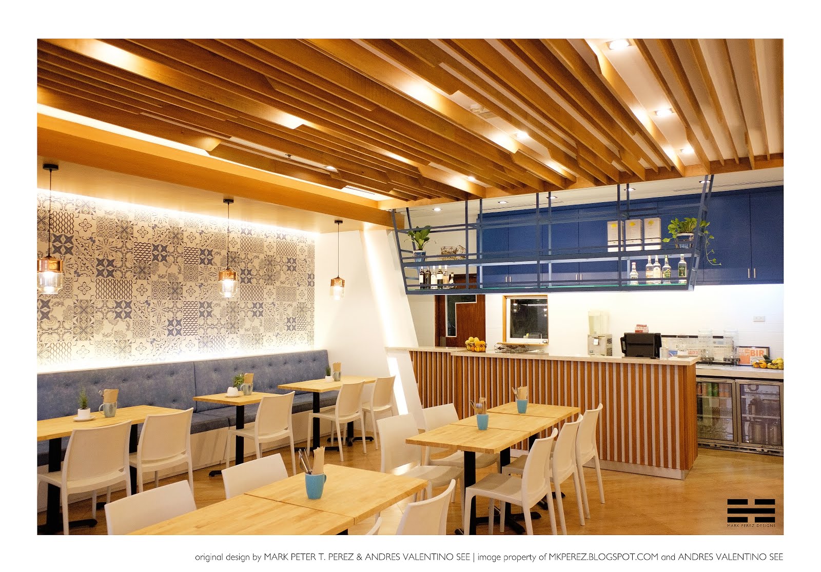
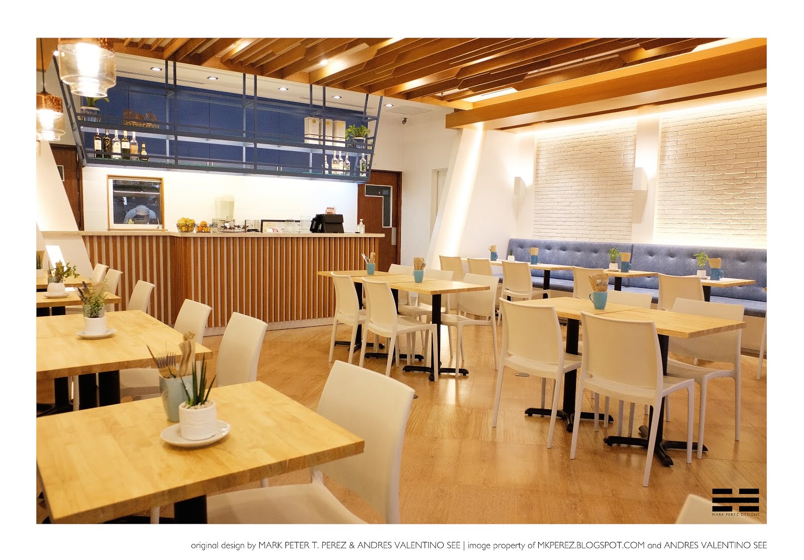
Tasked to give new life to this restaurant to cater to the young and vibrant crowd of U.P. Town Center, my partner Andres and I decided to go with a Greek fusion in the redesign of Kos Greek. A first for both of us, my partner and I wanted to leave a lasting impact on our first restaurant project. Rather than going very traditional, our approach was a subtle combination of Greek themes and modern design elements. This allows us to create a new twist to this beloved family restaurant.
Blue tones and wood finishes create a Greek vibe with a cozy feel, a fresh take to the monotonous color tones of the original design. On the walls, Andres and I went for an
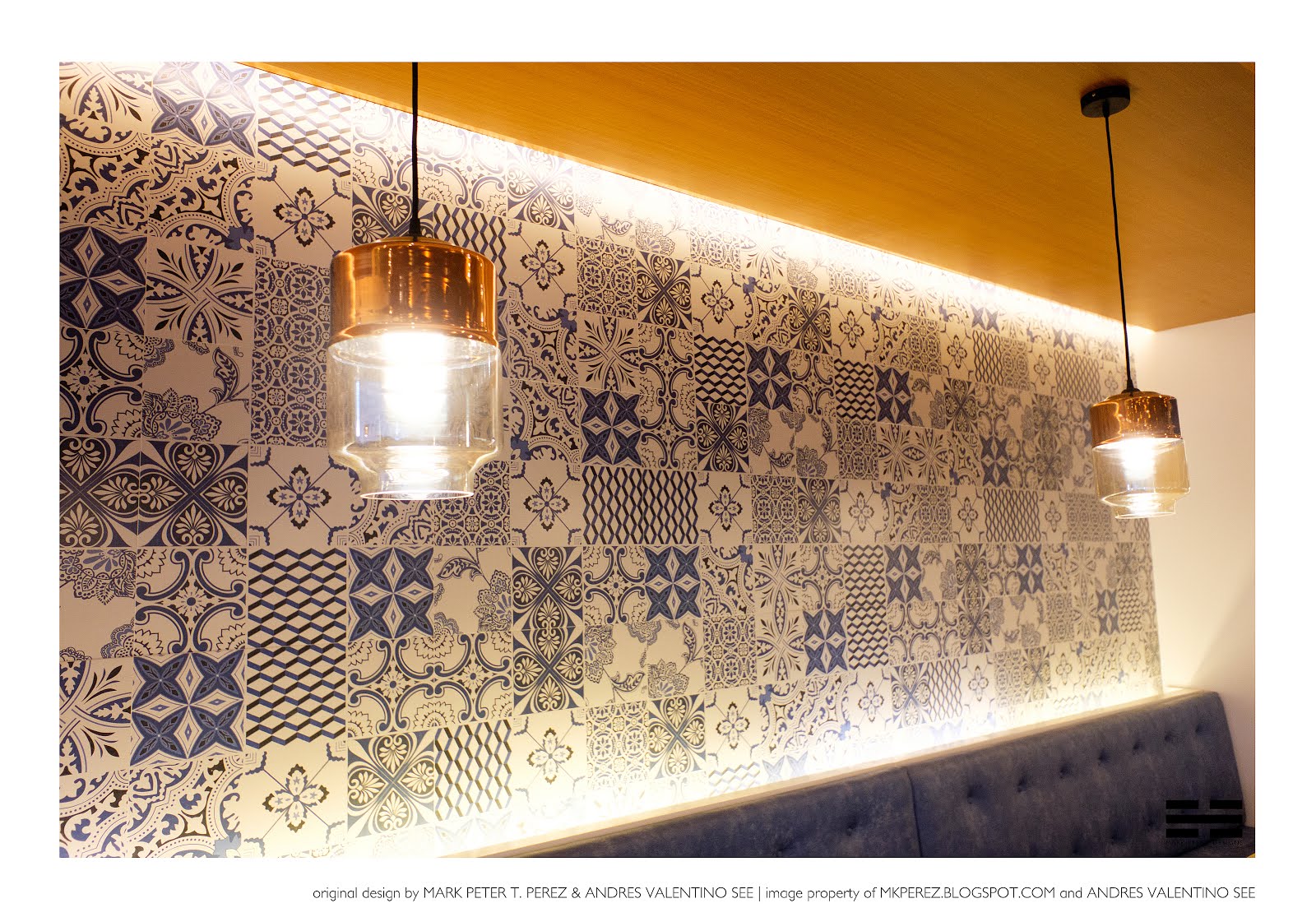
Instagrammable
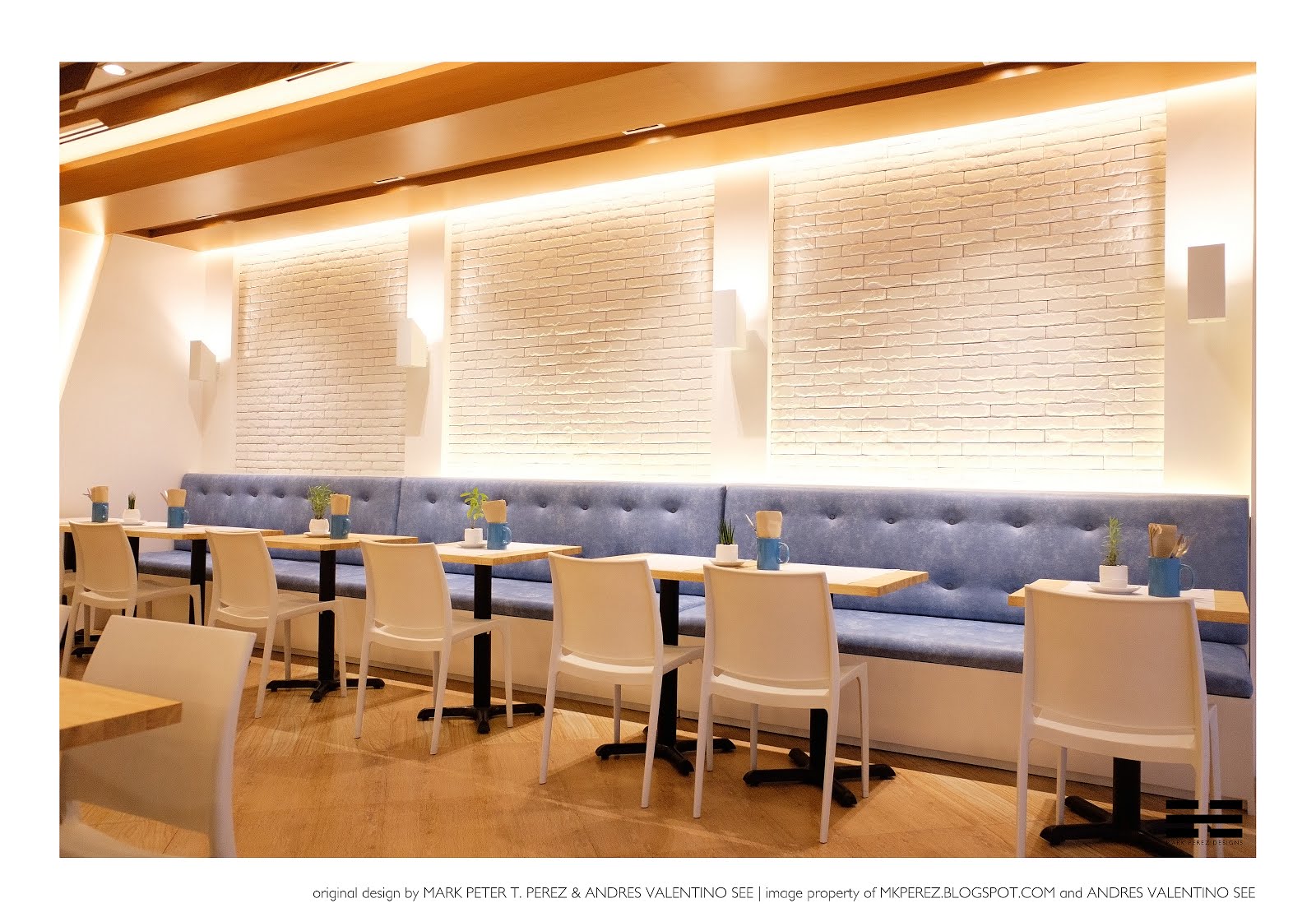
look by using contrasting elements. One side has a more natural feel with textured white bricks, while the other can serve as a more colorful backdrop with blue and white patterned tiles.
A modern take on a typical trellis was applied to the ceiling as well, playing with different layers and angles to create a statement piece that catches the eye and draws in visitors. Following those lines down the middle grants you a view to the new bar counter at the center of the restaurant, with its similar trellis look in wood finish and its beautiful stone top. Framing the bar counter are the existing angled walls, given new life with the addition of cove lighting.
Many changes were made while some essential elements were retained such as the furniture and the floor tiles. One other thing that still remained was the heart and soul of the place, which is the authentic tasting Greek food. All in all, the end result was a brand new Kos Greek. It is a place we enjoyed designing and eating at, and a project we can definitely say is one for the books!
Angled cuts create a modern look while using traditional materials create for an interesting look on the ceiling.
For a classic and classy Greek look, blue and white patterned wall tiles were paired with glass lamps with copper accents.
The angled display shelf mirrors the existing angled walls on opposite sides of the restaurant. LED strip lights were added to highlight the items on display.
White bricks were used for a rustic vibe combined with effective use of lighting to highlight the texture.
Add caption
bgc
PROJECT: The Rachel Project ( SOMA Residences Studio Unit)
When designing for a friend, you tend to go deeper than the stories they tell and end up designing more than what they asked. Th...
When designing for a friend, you tend to go deeper than the stories they tell and end up designing more than what they asked. The more intimately you know them, the more the design signifies that person.
This project, named The Rachel Project, was one of the most exciting projects I've done since this is for my good friend, Rachel.
This studio unit, measuring almost 40 sq.m. was the perfect space to play around with some ideas for my fun-loving friend. For starters, she wanted a nice clean look with a natural feel that's why we went with a neutral palette and straight lines. After living here for a few years, she definitely outgrew the space which no longer works for her lifestyle.
Knowing that she loves reading, we made sure to put in a lot of shelves and storage for all her personal belongings, most especially her books. Besides being an avid literature fan and a writer, we put in a custom work desk complete with power outlets and drawers. One nifty feature is that the design of the desk allows it to double as a room divider. The box shelf above the desk is divided as well, with one side having space for small items and the opposite side which is more suitable for books.
Being over ten years, the place definitely needed some work. The old cabinets needed to go, so we replaced them with a customized wardrobe and shoe cabinet. Since the existing flooring was exposed to some water damage, we decided to go with wood style floor tiles which served the purpose of looking cozy, but still be easy to clean and water-proof. The toilet and bath needed some work as well. Here we provided Rachel a larger vanity mirror with shelves, as well as a customized lavatory counter that replaced her old pedestal type one. Lastly, the kitchen needed an upgrade with a new counter as well as the addition of classic looking subway tiles for the back splash.
Overall, this project was both a challenge and a joy to do. A lot of repairs needed to be done and a lot of new features were added as well. At the end of the day, I'm happy to say that the project was a success and I was able to help my friend design a space that's truly her.
contemporary
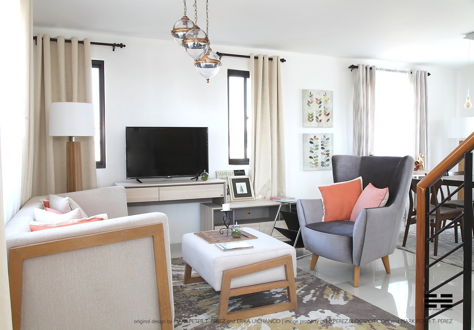
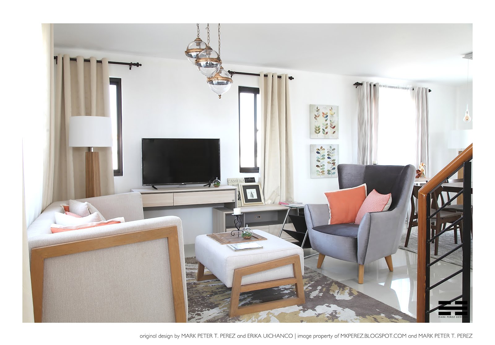
PROJECT: ARIZONA (Country Living at RHomes Grand Tierra Part 2)
Country living with hints of modern elegance characterizes these model homes for one of the newest developments of Robinsons Land in Nort...
Country living with hints of modern elegance characterizes these model homes for one of the newest developments of Robinsons Land in Northern Luzon. Continuing from my post in Part 1, this time Part 2 is about the Arizona unit that my friend Erika and I designed, furnished and styled.
The smaller of the two homes, the design of the Arizona was a bit different compared to the Nevada unit (check Part 1
here
). A more earthy palette is used here, meaning more browns, beige and orange that creates a more rustic look
. Despite having a smaller space, it was still important to have a cushioned sofa and different layers of throw pillows for a very cozy living space. The perfect balance of lightness and comfort was achieved by mixing different styles of furniture, keeping in mind to choose the right size and just the essential pieces for a smaller space. Just a few tips to create that cozy living space, use soft furnishings such as curtains and upholstered furniture. Try to opt for more curves and less sharp angles because visually, they have softer features and they also make moving around the much easier.
Moving up, you're greeted first with the cozy master bedroom. Neutral hues creates a more elegant look, brown curtains were matched with the patterned wallpaper creating that perfect accent wall. To maximize the bed space, floor lamps were used instead of the usual side tables to give space for a bigger bed.
Compared to the Nevada house, the kids' bedrooms here both have smaller sizes. It was quite a challenge to balance size and comfort for each but luckily, we were able to find the perfect furniture pieces for both. To keep things interesting, each room was designed to have it's own identity with the help of unique graphics on the walls, as well as a few simple accessories. Lastly, the right choice of colors and a good amount of natural light gave these rooms a nice open feel despite its cozy size.
Load more
Subscribe to:
Posts (Atom)
Contact
Name
Email
*
Message
*
Newsletter
Follow Me
Top 3
Follow me
Mailchimp Link
//blogspot.us14.list-manage.com/subscribe/post?u=4e4913dc1c4a51191d1fd265b&id=b70ad56a93
Labels
accent wall
adventurer
airbnb
annex
asian
basketball
beach
bgc
black
blue
blue and white
board
bonifacio global city
bricks
bright
cafe
cajon
chemical drum
chinese
classic
colonial
commercial
condo
condominium
contemporary
copper
country
country living
cozy
culinary institute
custom
design
design project
desk
dining
diy
do it yourself
drum
eclectic
edgy
elegant
first gourmet academy
furniture
fusion
geometric
glam
gold
gold chair
gold dipping
gray
Greek
green
greenbelt
high end
hom
home
homey
hungry
ikea
industrial
inspired
institutional design
instrument
interior
interior design
interior styling
interiors
kitchen
kos
loft
lush
luxury
manhattan
manila
marble
metal
mid century
minimalist
modern
modern design
mountain
multifunctional
neutrals
paint
paint dipping
paradise
percussion
philippines
pink
pinterest
pipes
pizza
porfolio
portfolio
project
recycle
red
renders
residential
resort
restaurant
robinsons land
rustic
rusty
scandinavian
serendra
stool
storage
styling
subway tiles
table
tiles
timeless
tropical
up town center
upcycle
upscale
vibrant
white
wood
yellow
young
Your Name
Email Address
*
Menu
Home
About
Portfolio
Design Proposals
Furniture
Instagram
D.I.Y.